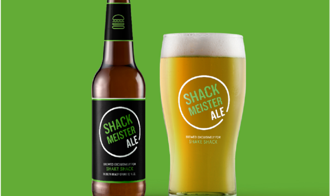
In early 2020, Shake Shack asked the team at JD&Co Design to provide logo concepts to streamline branding for their signature beer, Shackmeister Ale.
Much of the direction from the Shake Shack team was inspired by neon beer and bar signage, so I provided a handful of concepts based on that.
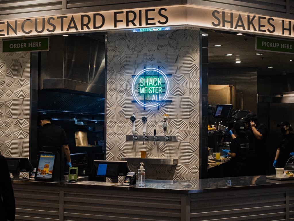
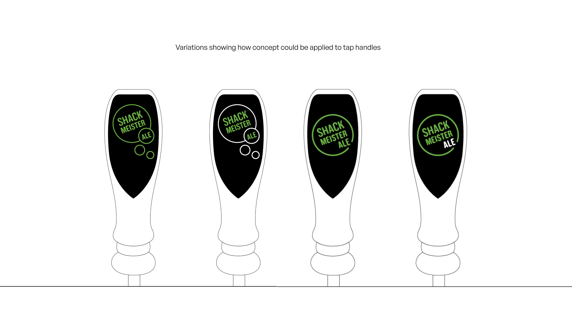
The final concept, which was approved and launched, is an interation of one of my initial concepts. Examples of the final logo mocked up on beer packaging, neon signage and tap handles are below. Other first iteration concepts also featured.
Image of the Singapore Shake Shack location courtesy of hungrygowhere.com.
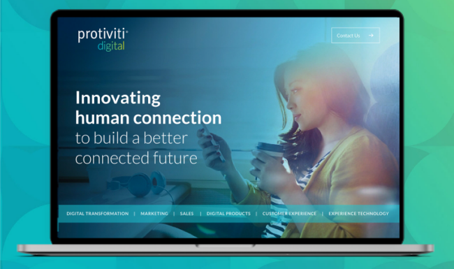
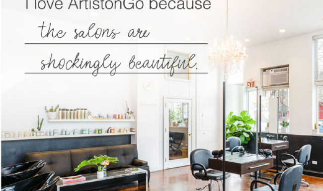
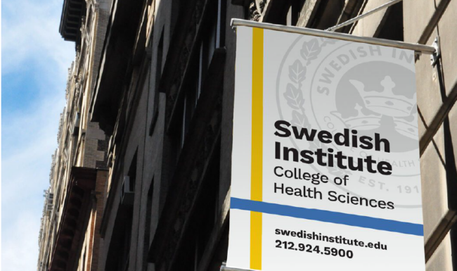
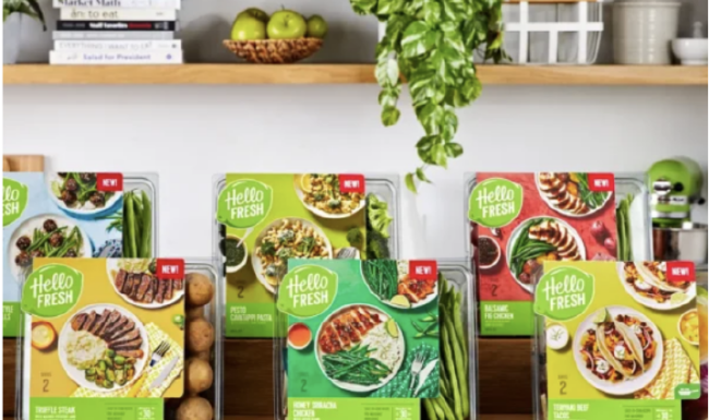
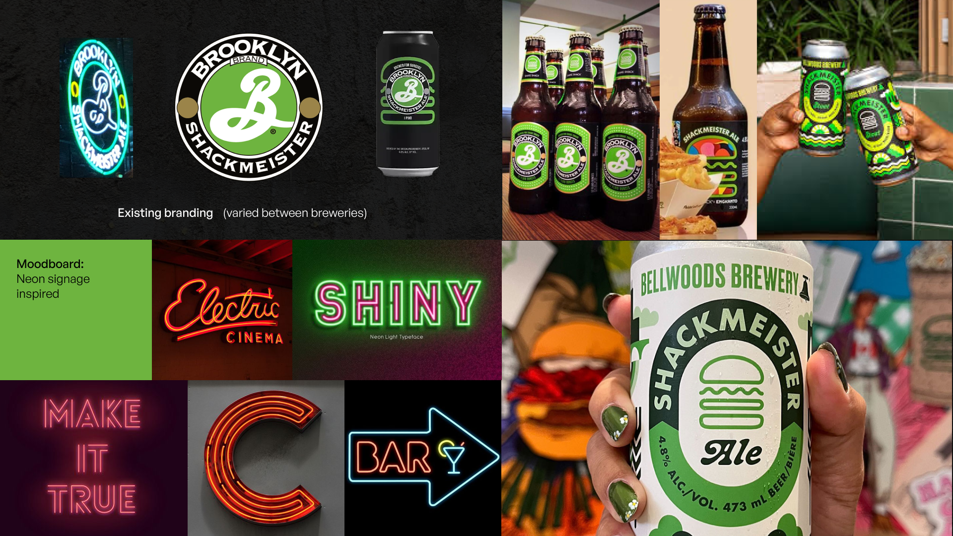
Moodboard for direction + existing branding
Direction from the Shake Shack marketing team was to explore something minimal and modern, taking inspiration from neon bar signage. The green/black color palette is owned by both Shake Shack and Brooklyn Brewery, allowing for seamless co-branding.
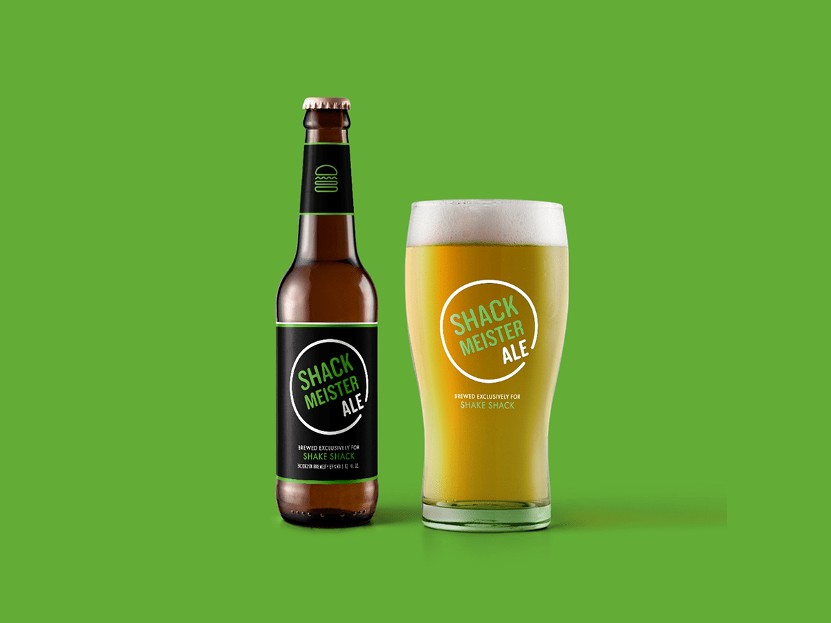
Other proposed concepts: